Architecture AWS, modélisée en UML
Le diagramme AWS habituel est un mur d'icônes de services qui dit quels produits vous avez achetés. Voici l'autre sorte : deux diagrammes qui disent ce qui peut atteindre quoi, sur quel port, et quelles parties vous appartiennent et sont remplaçables.
8 min de lectureUML 2.5.135 sur 35
La réponse courte
- Un mur d'icônes dit quels produits vous avez achetés. Un diagramme de déploiement nomme protocoles, ports et directions - ce que demande une revue de sécurité.
- Un VPC ou une région est un nœud qui contient les autres. La relation est la contenance : aucune flèche n'est nécessaire et la frontière se voit.
- Incluez un service si un chemin de requête le traverse ou s'il détient un état à migrer. Laissez de côté IAM, CloudWatch et Secrets Manager.
- Coupez l'image en deux. La vue composants traverse un changement de plateforme sans bouger ; seule la vue de déploiement change avec l'infrastructure.
01Deux sortes de diagramme AWS#
Le familier est une toile d'icônes de services reliées par des traits. Il est vraiment bon pour une seule chose - montrer quels produits sont en jeu à quelqu'un qui sait déjà ce que ces produits font - et c'est pourquoi tout support de présentation AWS en contient un.
Ce qu'il ne porte pas, c'est le sens, le protocole, le port, ni si un trait veut dire "appelle par le réseau" ou "est configuré par". Ces quatre-là sont tout le contenu d'une revue de sécurité, et c'est ce que quelqu'un devant une alerte à trois heures du matin essaie de reconstituer. Un diagramme de déploiement les porte, au prix de ressembler moins à une brochure.
02Lire la topologie#
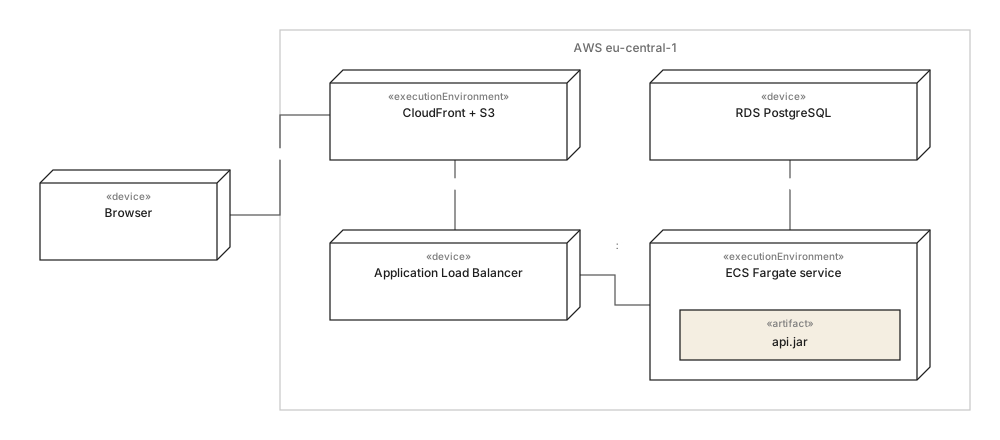
Trois choses de la figure d'ouverture méritent d'être reprises dans la vôtre, et aucune ne concerne AWS.
- La région est une boîte, pas une étiquette. L'imbrication est la relation de contenance, donc la question de frontière - qu'y a-t-il dans eu-central-1 et qu'y a-t-il dehors - est tranchée par la géométrie plutôt que par une légende. Que le navigateur soit à l'extérieur est le fait le plus important du diagramme.
- Chaque chemin porte un protocole et un port."HTTPS", "TCP 5432". Un trait non étiqueté entre un répartiteur de charge et un service est un trait qui n'a jamais été confronté à un groupe de sécurité.
- L'artefact est à l'intérieur du noeud qui l'exécute.
api.jardans le service Fargate, et non à côté avec une flèche. Ce qui est déployé où est la question pour laquelle cette sorte de diagramme existe.
Ce qui est délibérément absent : IAM, CloudWatch, Secrets Manager, la passerelle NAT. Chacun est réel et aucun n'est participant d'un chemin de requête - ce sont des configurations, et les mettre sur le diagramme double sa taille sans répondre à une question que quiconque a posée.
03Le même système sans les fournisseurs#

C'est le diagramme qui rend une architecture cloud relisable plutôt que simplement documentée. L'Order API dépend de IOrderStore et IFileStore ; les adaptateurs nomment les produits. Tout ce qui est au-dessus des adaptateurs est portable par construction, et tout ce qui ne l'est pas tient dans deux boîtes que l'on peut compter.
C'est aussi la moitié qui ne change pas quand l'infrastructure change. Passez d'ECS à EKS, ou d'eu-central-1 à deux régions, et la figure d'ouverture est redessinée tandis que celle-ci reste intacte - la raison pratique de les garder séparées plutôt que de les fondre en une seule image impressionnante.
En une ligne chacun
- 01Les diagrammes d'icônes nomment des produits ; les diagrammes de déploiement nomment des chemins, des protocoles et des ports.
- 02Dessinez la région comme un noeud contenant : l'imbrication est la frontière, aucune flèche nécessaire.
- 03Étiquetez chaque chemin de communication avec son protocole et son port, sinon il n'a pas été vérifié.
- 04Placez les artefacts à l'intérieur du noeud qui les exécute.
- 05Laissez IAM, la journalisation et les secrets de côté : ce sont des configurations, pas des participants.
- 06Gardez la vue composants à part : elle survit au changement de plateforme qui invalide la topologie.
Le même traitement appliqué à une boutique est dans l'architecture e-commerce, modélisée, et la question des frontières de service est poussée plus loin dans l'exemple microservices.
04Questions fréquentes#
Faut-il faire un diagramme AWS en UML ou avec les icônes AWS ?
Les deux, pour des lecteurs différents. Le diagramme d'icônes est meilleur pour vendre et pour accueillir un arrivant, car chacun reconnaît les produits ; un diagramme de déploiement UML est un meilleur document de travail, car il nomme protocoles, ports et directions - ce que demandent une revue de sécurité et un incident à trois heures du matin.
Comment représenter un VPC ou une région en UML ?
Comme un nœud qui contient les autres, dessiné par imbrication. La relation est le contenant lui-même, donc aucune flèche n'est nécessaire, et la question de la frontière - ce qui est dans la région et ce qui n'y est pas - apparaît sur l'image plutôt que dans une légende.
Faut-il dessiner tous les services AWS utilisés ?
Non, et c'est précisément ce qui rend ces diagrammes inutilisables. Incluez un service si un chemin de requête le traverse ou s'il détient un état qu'il faudrait migrer ; laissez de côté ce qui relève de la configuration plutôt que d'un participant, comme IAM, CloudWatch ou Secrets Manager.
Comment éviter qu'un diagramme cloud vieillisse après une migration ?
Coupez-le en deux. La vue composants nomme les contrats dont dépend le code et traverse un changement de plateforme sans bouger ; seule la vue de déploiement doit changer, ce qui transforme un redessin complet en la modification d'un seul diagramme.
Dans cette série
- 01Qu'est-ce que UML ?
- 02Symboles UML
- 03Choisir un diagramme
- 04Diagrammes de classes
- 05Exemples de diagrammes de classes
- 06Dessiner un diagramme de classes
- 07Symboles du diagramme de classes
- 08Diagrammes de séquence
- 09Exemples de diagrammes de séquence
- 10Dessiner un diagramme de séquence
- 11Diagrammes de cas d'utilisation
- 12Exemples de cas d'utilisation
- 13Diagrammes d'activité
- 14Exemples d'activité
- 15Diagrammes états-transitions
- 16Exemples d'états-transitions
- 17Diagrammes de composants
- 18Exemples de composants
- 19Dessiner un diagramme de composants
- 20Symboles de composants
- 21Diagrammes de déploiement
- 22Exemples de déploiement
- 23Diagrammes d'objets
- 24Diagrammes de paquetages
- 25Diagrammes de structure composite
- 26Diagrammes de communication
- 27Séquence vs communication
- 28Diagrammes de temps
- 29Diagrammes globaux d'interaction
- 30Diagrammes de profil
- 31UML avec l'IA
- 32Exemple e-commerce
- 33Exemple bancaire
- 34Exemple microservices
- 35Exemple AWS
À lire aussi
Diagrammes de structure
Pratique de la modélisation
Diagrammes de structure
Pratique de la modélisation
Diagrammes de structure
Pratique de la modélisation