Architektura AWS namodelovaná v UML
Běžný AWS diagram je stěna ikonek služeb, která říká, které produkty jste si koupili. Tohle je ten druhý druh: dva diagramy, které řeknou, co smí kam sáhnout, přes který port a které části jsou vaše na výměnu.
8 min čteníUML 2.5.135 z 35
Krátká odpověď
- Stěna ikonek říká, které produkty jste si koupili. Diagram nasazení pojmenovává protokoly, porty a směry - a právě na to se ptá bezpečnostní revize.
- VPC nebo region je uzel, který ostatní obsahuje. Vztahem je obsažení, takže není potřeba šipka a hranice je vidět.
- Službu zahrňte, pokud přes ni vede cesta požadavku nebo drží stav, který byste museli migrovat. IAM, CloudWatch a Secrets Manager vynechte.
- Rozdělte obrázek na dva. Pohled na komponenty přežije přechod na jinou platformu nedotčený; měnit se musí jen pohled na nasazení.
01Dva druhy AWS diagramu#
Ten známý je plátno s ikonami služeb a čárami mezi nimi. Je opravdu dobrý v jedné věci - ukázat, které produkty jsou ve hře, někomu, kdo už ví, co ty produkty dělají - a proto ho obsahuje každá AWS prezentace.
Co nenese, je směr, protokol, port ani to, jestli čára znamená "volá přes síť", nebo "je konfigurován přes". Právě ty čtyři jsou celým obsahem bezpečnostního posudku a právě je se snaží ve tři ráno zrekonstruovat někdo, kdo kouká na alert. Diagram nasazení je nese za cenu toho, že vypadá méně jako brožura.
02Jak číst topologii#
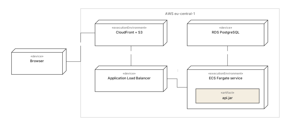
Tři věci na titulním obrázku se vyplatí okopírovat do vlastního a ani jedna není o AWS.
- Region je box, ne popisek. Vnoření je vztah obsažení, takže hraniční otázka - co je uvnitř eu-central-1 a co ne - je zodpovězená geometrií, ne legendou. To, že prohlížeč je mimo něj, je nejdůležitějším faktem na diagramu.
- Každá cesta nese protokol a port."HTTPS", "TCP 5432". Neoznačená čára mezi load balancerem a službou je čára, která nikdy nebyla prověřená proti bezpečnostní skupině.
- Artefakt sedí uvnitř uzlu, který ho spouští.
api.jaruvnitř služby Fargate, ne vedle ní se šipkou. Co je kam nasazené, je otázka, kvůli které tenhle druh diagramu existuje.
Co záměrně chybí: IAM, CloudWatch, Secrets Manager, NAT gateway. Každé je skutečné a ani jedno není účastníkem cesty požadavku - jsou to konfigurace, a dát je na diagram zdvojnásobí jeho velikost, aniž by odpověděly na otázku, kterou někdo položil.
03Tentýž systém bez dodavatelů#

Tohle je diagram, který dělá cloudovou architekturu posuzovatelnou, ne jen zdokumentovanou. Order API závisí na IOrderStore a IFileStore; produkty pojmenovávají adaptéry. Všechno nad adaptéry je přenositelné už konstrukcí a všechno, co přenositelné není, je ve dvou boxech, které umíte spočítat.
Je to zároveň ta polovina, která se nemění, když se mění infrastruktura. Přejděte z ECS na EKS nebo z eu-central-1 na dva regiony a titulní obrázek se překreslí, zatímco tenhle zůstane nedotčený - což je praktický důvod držet je odděleně místo sloučení do jednoho působivého obrázku.
Po jednom řádku na každé
- 01Ikonové diagramy pojmenovávají produkty; diagramy nasazení pojmenovávají cesty, protokoly a porty.
- 02Region kreslete jako obsahující uzel - hranicí je vnoření, šipka není potřeba.
- 03Každou komunikační cestu označte protokolem a portem, jinak nebyla prověřená.
- 04Artefakty dejte dovnitř uzlu, který je vykonává.
- 05IAM, logování a tajemství nechte mimo: jsou to konfigurace, ne účastníci.
- 06Pohled na komponenty držte odděleně - přežije přechod na jinou platformu, který zneplatní topologii.
Totéž zpracování aplikované na obchod je v článku e-shopová architektura, namodelovaná, a otázka hranic služeb je dotažená dál v příkladu mikroslužeb.
04Časté dotazy#
Má být diagram architektury AWS v UML, nebo v ikonách AWS?
Obojí, pro jiné čtenáře. Diagram s ikonami je lepší na prodej a zaškolení, protože produkty zná každý; UML diagram nasazení je lepší pracovní dokument, protože pojmenovává protokoly, porty a směry - a právě na to se ptá bezpečnostní revize i incident ve tři ráno.
Jak na UML diagramu zobrazit VPC nebo region?
Jako uzel, který ostatní obsahuje, nakreslený tak, že jsou v něm vnořené. Vztahem je samotné obsažení, takže není potřeba šipka, a otázka hranice - co je v regionu a co mimo něj - je vidět na obrázku místo v legendě.
Musím nakreslit každou službu AWS, kterou používáme?
Ne a právě kreslení všech dělá tyhle diagramy nepoužitelnými. Službu zahrňte, pokud přes ni vede cesta požadavku nebo drží stav, který byste museli migrovat; vynechte vše, co je spíš konfigurace než účastník, tedy IAM, CloudWatch nebo Secrets Manager.
Jak zabránit tomu, aby cloudový diagram po migraci zestárl?
Rozdělte ho na dva. Pohled na komponenty pojmenovává smlouvy, na kterých závisí váš kód, a přechod na jinou platformu přežije nedotčený; měnit se musí jen pohled na nasazení, čímž se z překreslení všeho stane úprava jediného diagramu.
V této sérii
- 01Co je UML?
- 02Symboly UML
- 03Výběr diagramu
- 04Diagramy tříd
- 05Příklady diagramů tříd
- 06Jak nakreslit diagram tříd
- 07Symboly diagramu tříd
- 08Sekvenční diagramy
- 09Příklady sekvenčních diagramů
- 10Jak nakreslit sekvenční diagram
- 11Diagramy případů užití
- 12Příklady případů užití
- 13Diagramy aktivit
- 14Příklady aktivit
- 15Stavové diagramy
- 16Příklady stavových diagramů
- 17Diagramy komponent
- 18Příklady komponent
- 19Kreslení diagramu komponent
- 20Symboly komponent
- 21Diagramy nasazení
- 22Příklady nasazení
- 23Diagramy objektů
- 24Diagramy balíků
- 25Diagramy složené struktury
- 26Komunikační diagramy
- 27Sekvenční vs komunikační
- 28Časové diagramy
- 29Diagramy přehledu interakcí
- 30Diagramy profilů
- 31UML pomocí AI
- 32Příklad e-shopu
- 33Příklad banky
- 34Příklad mikroslužeb
- 35Příklad AWS
Související články
Diagramy struktury
Praxe modelování
Diagramy struktury
Praxe modelování
Diagramy struktury
Praxe modelování