AWS architecture, modelled in UML
The usual AWS diagram is a wall of service icons that says which products you bought. This is the other kind: two diagrams that say what may reach what, over which port, and which parts of it are yours to replace.
8 min readUML 2.5.135 of 35
The short answer
- An icon wall says which products you bought. A deployment diagram names protocols, ports and directions, which is what a security review asks about.
- A VPC or a region is a node that contains the others. Containment is the relationship, so no arrow is needed and the boundary is visible.
- Include a service if a request path crosses it or it holds state you would have to migrate. Leave out IAM, CloudWatch and Secrets Manager.
- Split the picture in two. The component view survives a re-platforming untouched; only the deployment view changes when the infrastructure does.
01Two kinds of AWS diagram#
The familiar one is a canvas of service icons with lines between them. It is genuinely good at one job - showing which products are in play to somebody who already knows what those products do - and it is why every AWS deck contains one.
What it does not carry is direction, protocol, port, or whether a line means "calls over the network" or "is configured by". Those four are the entire content of a security review, and they are what somebody staring at an alert at 3am is trying to reconstruct. A deployment diagram carries them, at the cost of looking less like a brochure.
02Reading the topology#
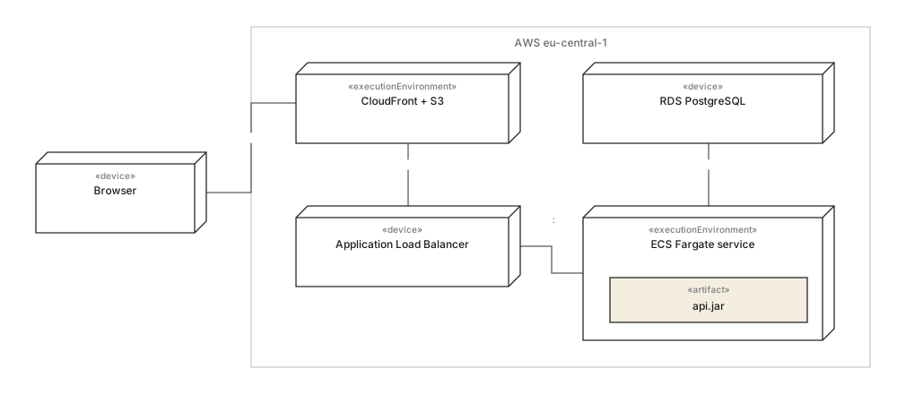
Three things on the hero figure are worth copying into your own, and none of them is about AWS.
- The region is a box, not a label. Nesting is the containment relationship, so the boundary question - what is inside eu-central-1 and what is not - is answered by geometry rather than by a legend. The browser being outside it is the most important fact on the diagram.
- Every path carries a protocol and a port."HTTPS", "TCP 5432". An unlabelled line between a load balancer and a service is a line that has never been checked against a security group.
- The artifact sits inside the node that runs it.
api.jarinside the Fargate service, rather than beside it with an arrow. What is deployed where is the question this diagram kind exists for.
What is deliberately absent: IAM, CloudWatch, Secrets Manager, the NAT gateway. Every one is real and none of them is a participant in a request path - they are configuration, and putting them on the diagram doubles its size while answering no question anybody asked.
03The same system without the vendors#

This is the diagram that makes cloud architecture reviewable rather than merely documented. The Order API depends on IOrderStore and IFileStore; the adapters name the products. Everything above the adapters is portable by construction, and everything that is not portable is in two boxes you can count.
It is also the half that does not change when the infrastructure does. Move from ECS to EKS, or from eu-central-1 to two regions, and the hero figure is redrawn while this one is untouched - which is the practical reason to keep them apart rather than merging them into one impressive picture.
In one line each
- 01Icon diagrams name products; deployment diagrams name paths, protocols and ports.
- 02Draw the region as a containing node - nesting is the boundary, no arrow needed.
- 03Label every communication path with its protocol and port, or it has not been checked.
- 04Put artifacts inside the node that executes them.
- 05Leave IAM, logging and secrets off: they are configuration, not participants.
- 06Keep the component view separate - it survives the re-platforming that invalidates the topology.
The same treatment applied to a shop is in e-commerce architecture, modelled, and the service-boundary question is taken further in the microservices example.
04Common questions#
Should an AWS architecture diagram use UML or AWS icons?
Both, for different readers. The icon diagram is the better sales and onboarding picture because everybody recognises the products; a UML deployment diagram is the better working document because it names protocols, ports and directions, which is what a security review and a 3am incident actually ask about.
How do I show a VPC or a region on a UML diagram?
As a node that contains the others, drawn by nesting them inside it. Containment is the relationship, so no arrow is needed, and it puts the boundary question - what is inside the region and what is outside it - where a reader can see it rather than in a legend.
Do I have to draw every AWS service we use?
No, and drawing them all is what makes these diagrams unusable. Include a service if a request path crosses it or if it holds state you would have to migrate; leave out anything that is configuration rather than a participant, such as IAM, CloudWatch or Secrets Manager.
How do I stop a cloud diagram going stale after a migration?
Split it in two. The component view names contracts your code depends on and survives a re-platforming untouched; only the deployment view has to change when the infrastructure does, which turns a full redraw into an edit of one diagram.
In this series
- 01What is UML?
- 02UML symbols
- 03Choosing a diagram
- 04Class diagrams
- 05Class diagram examples
- 06How to draw a class diagram
- 07Class diagram symbols
- 08Sequence diagrams
- 09Sequence diagram examples
- 10How to draw a sequence diagram
- 11Use case diagrams
- 12Use case examples
- 13Activity diagrams
- 14Activity examples
- 15State machine diagrams
- 16State machine examples
- 17Component diagrams
- 18Component examples
- 19Drawing a component diagram
- 20Component symbols
- 21Deployment diagrams
- 22Deployment examples
- 23Object diagrams
- 24Package diagrams
- 25Composite structure diagrams
- 26Communication diagrams
- 27Sequence vs communication
- 28Timing diagrams
- 29Interaction overview diagrams
- 30Profile diagrams
- 31UML with AI
- 32E-commerce example
- 33Banking example
- 34Microservices example
- 35AWS example
Related reading
Structure diagrams
Modelling practice
Structure diagrams
Modelling practice
Structure diagrams
Modelling practice