Exemples de diagrammes de déploiement
Trois diagrammes de déploiement de systèmes que vous reconnaîtrez - une application web trois tiers, un cluster Kubernetes et un pool derrière un répartiteur de charge - chacun avec la raison de ce qui est dessiné et de ce qui est volontairement omis.
8 min de lectureUML 2.5.122 sur 35
La réponse courte
- Quatre noeuds, trois chemins de communication étiquetés et trois flèches de déploiement font un diagramme complet : navigateur, serveur web, serveur d'application, base de données.
- Un conteneur en cours d'exécution est un environnement d'exécution, donc un noeud. L'image dont il est issu est un artefact : la dessiner en noeud est l'erreur habituelle.
- Montrez la redondance par une multiplicité comme 3..* sur un noeud. Un diagramme affirmant exactement trois instances est faux dès le premier autoscaling.
- Ne dessinez que de quoi répondre à la question qui vous a fait dessiner. Chaque noeud en plus est une affirmation à maintenir vraie après la prochaine migration.

01Exemple 1 : une application web à trois niveaux#
Le diagramme ci-dessus est celui qu'il vaut la peine de savoir dessiner de mémoire. Un navigateur, un serveur web qui termine le TLS, un serveur d'application, une base de données. Trois chemins de communication portant le protocole et le port, et trois artefacts posés sur les noeuds qui les exécutent.
Deux décisions y méritent d'être nommées. D'abord, les étiquettes de protocole sont la raison de l'utilité du diagramme : HTTPS, HTTP/8080, TCP/5432 constitue tout le contenu de la plupart des revues de sécurité, et un diagramme sans elles n'est que quatre boîtes que n'importe qui aurait devinées. Ensuite, les artefacts portent de vrais noms de fichiers - orders.jar, pas « application » - parce qu'un diagramme de déploiement parle de choses physiques, et qu'un build produit des fichiers qui ont des noms.
02Exemple 2 : un cluster Kubernetes#
Les conteneurs font hésiter, parce qu'un conteneur est à la fois une chose qui tourne et une chose qui a été construite. UML sépare déjà les deux : le conteneur en cours d'exécution est un environnement d'exécution, donc un noeud, et l'image dont il est parti est un artefact, déployé dessus.

Rien dans la forme de ce diagramme ne diffère de celui à trois niveaux, et c'est bien le propos : l'environnement d'exécution a changé, pas la notation. Le répartiteur de charge est un «device» parce que c'est de l'infrastructure dans laquelle vous ne déployez pas. Le contrôleur d'ingress et le pod sont des «execution environment» parce que d'autres choses tournent dedans. Le tag d'image orders:1.4.2est un artefact parce qu'un build l'a produit, et mettre la version dans l'étiquette est ce qui permet au diagramme de répondre à « qu'est-ce qui tourne en production en ce moment ».
La base managée se tient en bordure comme un simple appareil. C'est le dessin honnête : on ne déploie pas d'artefacts sur un service exploité par quelqu'un d'autre, et prétendre que le schéma est installé « sur RDS » n'est vrai qu'au sens où il y a été appliqué une fois.
03Exemple 3 : un pool derrière un répartiteur#
La raison la plus fréquente d'ouvrir un diagramme de déploiement est de savoir ce qui se passe quand une boîte meurt. Cette question a une forme, et il vaut la peine de la dessiner explicitement plutôt que de la laisser à une note de bas de page.
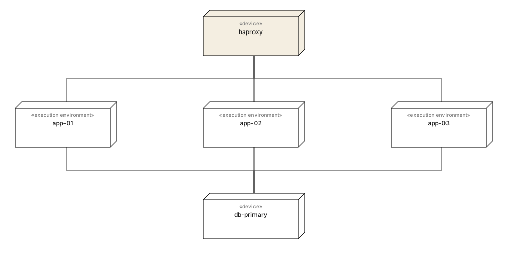
Trois noeuds d'application derrière un répartiteur, tous écrivant sur une seule base primaire. Dessiné ainsi, le point de défaillance unique est visible sans que personne ait à le dire : la couche applicative s'évase et la couche de données non. C'est une phrase sur laquelle quelqu'un agira, et elle n'a demandé aucune notation supplémentaire.
Quand le nombre varie à l'exécution, remplacez les trois noeuds par un seul portant une multiplicité - app-node [3..*] - plutôt que de dessiner un nombre arbitraire. Un diagramme qui affirme exactement trois est faux dès la première mise à l'échelle du groupe, et un diagramme réputé faux cesse d'être consulté.
04Ce qu'il faut laisser de côté#
Tout diagramme de déploiement qui devient inutile le devient de la même façon : quelqu'un a continué d'ajouter des noeuds. La discipline consiste à décider à quoi sert le diagramme avant que la deuxième boîte ne soit posée.
À utiliser quand
- Protocoles et ports sur chaque chemin de communication : c'est le contenu de la plupart des revues.
- De vrais noms d'artefacts avec versions, pour que le diagramme réponde à ce qui tourne maintenant.
- Une instance représentative par rôle, avec une multiplicité quand le nombre varie.
- Les services managés en simples appareils en bordure, avec la limite de ce que vous exploitez visible.
Préférer autre chose quand
- Les couches logiques : elles n'ont pas d'adresse et rien n'y est déployé.
- Chaque microservice d'un grand parc. Dessinez plutôt un sous-système par diagramme.
- La supervision, la journalisation et les agents d'intégration continue, sauf si le diagramme porte sur eux.
- Les nombres d'instances en direct, faux au moment où le diagramme est relu.
S'il vous faut la contrepartie qui montre le logiciel plutôt que les machines, c'est un diagramme de composants. Les deux se dessinent en général par paire, et celui de déploiement est le plus court.
05Ce qu'il faut retenir#
En une ligne chacun
- 01Quatre noeuds, des protocoles étiquetés et des artefacts nommés forment déjà un diagramme de déploiement complet.
- 02Un conteneur en exécution est un noeud ; l'image dont il est parti est un artefact. Les confondre est l'erreur habituelle avec les conteneurs.
- 03Les étiquettes de protocole et de port sont ce qui rend le diagramme digne d'être ouvert en revue.
- 04Dessinez une instance par rôle et employez une multiplicité quand le nombre varie à l'exécution.
- 05Si une boîte ne peut pas être pinguée, elle n'a pas sa place sur ce diagramme.
06Questions fréquentes#
Quel est un exemple simple de diagramme de déploiement ?
Un navigateur qui se connecte à un serveur web, celui-ci à un serveur d'application, et celui-ci à une base de données, avec un artefact déployé sur chacun. Quatre nœuds, trois chemins de communication étiquetés par protocole et trois flèches de déploiement font un diagramme complet et utile.
Comment dessiner un diagramme de déploiement pour Kubernetes ?
Modélisez les éléments d'exécution du cluster en nœuds et les images en artefacts. Le répartiteur de charge est un dispositif, le contrôleur d'ingress et chaque pod sont des environnements d'exécution, et l'image du conteneur est un artefact déployé sur le pod. Les services managés restent des dispositifs en bordure.
Les conteneurs sont-ils des nœuds ou des artefacts en UML ?
Les deux, selon le conteneur dont on parle. Un conteneur en cours d'exécution est un environnement d'exécution, donc un nœud, puisque autre chose y tourne. L'image dont il est issu est un artefact, car c'est un fichier produit par un build. Dessiner l'image en nœud est l'erreur la plus fréquente.
Comment montrer la redondance sur un diagramme de déploiement ?
Soit vous dessinez les instances, ce qui est honnête mais ne tient pas au-delà de quatre, soit vous dessinez un seul nœud avec une multiplicité dans le coin, par exemple app-node en 3..*. Prenez la seconde quand le nombre varie à l'exécution : un diagramme affirmant exactement trois est faux dès le premier autoscaling.
Quel niveau de détail pour un diagramme de déploiement ?
Assez pour répondre à la question qui vous a fait le dessiner. Une revue d'infrastructure veut les protocoles et les ports sur les chemins de communication ; un diagramme d'accueil veut quatre boîtes et rien d'autre. Chaque nœud en plus est une affirmation que quelqu'un devra maintenir vraie après la prochaine migration.
Dans cette série
- 01Qu'est-ce que UML ?
- 02Symboles UML
- 03Choisir un diagramme
- 04Diagrammes de classes
- 05Exemples de diagrammes de classes
- 06Dessiner un diagramme de classes
- 07Symboles du diagramme de classes
- 08Diagrammes de séquence
- 09Exemples de diagrammes de séquence
- 10Dessiner un diagramme de séquence
- 11Diagrammes de cas d'utilisation
- 12Exemples de cas d'utilisation
- 13Diagrammes d'activité
- 14Exemples d'activité
- 15Diagrammes états-transitions
- 16Exemples d'états-transitions
- 17Diagrammes de composants
- 18Exemples de composants
- 19Dessiner un diagramme de composants
- 20Symboles de composants
- 21Diagrammes de déploiement
- 22Exemples de déploiement
- 23Diagrammes d'objets
- 24Diagrammes de paquetages
- 25Diagrammes de structure composite
- 26Diagrammes de communication
- 27Séquence vs communication
- 28Diagrammes de temps
- 29Diagrammes globaux d'interaction
- 30Diagrammes de profil
- 31UML avec l'IA
- 32Exemple e-commerce
- 33Exemple bancaire
- 34Exemple microservices
- 35Exemple AWS
À lire aussi
Diagrammes de structure
Diagrammes de structure
Diagrammes de structure
Pratique de la modélisation
Diagrammes de structure
Diagrammes de structure