Príklady diagramov nasadenia
Tri diagramy nasadenia systémov, ktoré poznáte - trojvrstvová webová aplikácia, Kubernetes klaster a pool za load balancerom - vždy s odôvodnením, čo bolo nakreslené a čo zámerne vynechané.
8 min čítaniaUML 2.5.122 z 35
Krátka odpoveď
- Štyri uzly, tri označené komunikačné cesty a tri šípky nasadenia sú úplný diagram: prehliadač, webový server, aplikačný server, databáza.
- Bežiaci kontajner je vykonávacie prostredie, a teda uzol. Obraz, z ktorého bol spustený, je artefakt. Kresliť obraz ako uzol je obvyklá chyba.
- Redundanciu ukážte násobnosťou, napríklad 3..* na jednom uzle. Diagram tvrdiaci presne tri inštancie je nesprávny hneď po prvom autoškálovaní.
- Kreslite len toľko, aby to odpovedalo na otázku, kvôli ktorej ste kreslili. Každý ďalší uzol je tvrdenie, ktoré musí niekto po ďalšej migrácii udržať pravdivé.

01Príklad 1: trojvrstvová webová aplikácia#
Diagram vyššie je ten, ktorý sa oplatí vedieť nakresliť spamäti. Prehliadač, webový server ukončujúci TLS, aplikačný server, databáza. Tri komunikačné cesty nesúce protokol a port a tri artefakty položené na uzly, ktoré ich spúšťajú.
Dve rozhodnutia v ňom stojí za to pomenovať. Po prvé, popisky protokolov sú dôvodom, prečo je diagram užitočný: HTTPS, HTTP/8080, TCP/5432 je celým obsahom väčšiny bezpečnostných posudkov a diagram bez nich sú štyri boxy, ktoré by uhádol každý. Po druhé, artefakty sú skutočné názvy súborov - orders.jar, nie „aplikácia“ - lebo diagram nasadenia je o fyzických veciach a build produkuje súbory s menami.
02Príklad 2: klaster Kubernetes#
Kontajnery ľudí zneisťujú, lebo kontajner je zároveň vec, ktorá beží, aj vec, ktorá bola zostavená. UML tie dve už oddeľuje: bežiaci kontajner je vykonávacie prostredie, čo je uzol, a image, z ktorého sa spustil, je artefakt, ktorý je naň nasadený.

Tvar tohto diagramu sa nijako nelíši od toho trojvrstvového, a o to práve ide: zmenilo sa behové prostredie a notácia nie. Load balancer je «device», lebo je to infraštruktúra, do ktorej nenasadzujete. Ingress kontrolér a pod sú «execution environment», lebo vnútri nich bežia ďalšie veci. Tag image orders:1.4.2je artefakt, lebo ho vyprodukoval build, a práve dať verziu do popisky je to, čo robí diagram schopným odpovedať na otázku „čo beží práve teraz v produkcii“.
Spravovaná databáza sedí na okraji ako obyčajné zariadenie. To je poctivá kresba: artefakty nenasadzujete na službu, ktorú prevádzkuje niekto iný, a predstierať, že schéma je nainštalovaná „na RDS“, je pravda len v tom zmysle, že tam raz bola aplikovaná.
03Príklad 3: pool za load balancerom#
Najčastejším dôvodom, prečo si niekto otvorí diagram nasadenia, je zistiť, čo sa stane, keď jeden box zomrie. Tá otázka má tvar a oplatí sa ho nakresliť výslovne, nie nechať ho na poznámku pod čiarou.
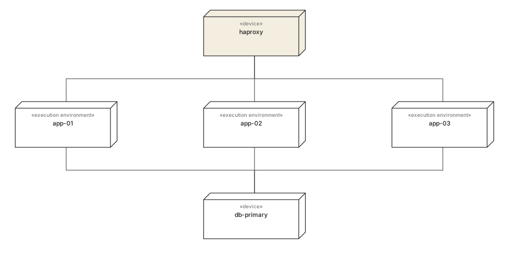
Tri aplikačné uzly za jedným load balancerom, všetky zapisujúce do jediného primárneho. Nakreslené takto je jediné miesto zlyhania viditeľné bez toho, aby ho musel niekto vysloviť: aplikačná vrstva sa vejárovito rozťahuje a dátová nie. To je veta, na ktorú niekto zareaguje, a nestála žiadnu notáciu navyše.
Keď sa počet za behu mení, nahraďte tie tri uzly jedným, ktorý nesie násobnosť - app-node [3..*] - namiesto kreslenia ľubovoľného počtu. Diagram, ktorý tvrdí presne tri, je nepravdivý pri prvom škálovaní skupiny, a diagram, o ktorom sa vie, že je nepravdivý, prestane byť konzultovaný.
04Čo vynechať#
Každý diagram nasadenia, ktorý sa stane zbytočným, sa ním stane rovnako: niekto stále pridával uzly. Disciplínou je rozhodnúť, na čo diagram je, skôr než pribudne druhý box.
Siahnite po ňom, keď
- Protokoly a porty na každej komunikačnej ceste - je to obsah väčšiny posudkov.
- Skutočné názvy artefaktov s verziami, aby diagram odpovedal, čo beží teraz.
- Jedna reprezentatívna inštancia na rolu, s násobnosťou, keď sa počet mení.
- Spravované služby ako obyčajné zariadenia na okraji, s viditeľnou hranicou toho, čo prevádzkujete.
Siahnite po niečom inom, keď
- Logické vrstvy - nemajú adresu a nič sa na ne nenasadzuje.
- Každú mikroslužbu vo veľkom prostredí. Radšej kreslite jeden podsystém na diagram.
- Monitoring, logovanie a CI agentov, pokiaľ diagram nie je o nich.
- Živé počty inštancií, ktoré sú v čase posudzovania diagramu už zlé.
Ak potrebujete náprotivok, ktorý ukazuje softvér namiesto strojov, je to diagram komponentov. Tie dva sa zvyčajne kreslia ako pár a ten na nasadenie je z nich kratší.
05Čo si zapamätať#
Po jednom riadku na každé
- 01Štyri uzly, označené protokoly a pomenované artefakty už sú kompletným diagramom nasadenia.
- 02Bežiaci kontajner je uzol; image, z ktorého sa spustil, je artefakt. Zámena tých dvoch je obvyklá kontajnerová chyba.
- 03Popisky protokolu a portu sú tým, čo robí diagram hodným otvorenia pri posudku.
- 04Kreslite jednu inštanciu na rolu a použite násobnosť, keď sa počet za behu mení.
- 05Ak sa na box nedá pingnúť, na tento diagram nepatrí.
06Časté otázky#
Aký je jednoduchý príklad diagramu nasadenia?
Prehliadač sa pripája na webový server, ten na aplikačný server a ten na databázu, pričom na každom je nasadený jeden artefakt. Štyri uzly, tri komunikačné cesty označené protokolom a tri šípky nasadenia sú úplný a užitočný diagram.
Ako nakresliť diagram nasadenia pre Kubernetes?
Behové časti klastra modelujte ako uzly a obrazy ako artefakty. Load balancer je zariadenie, ingress kontrolér a každý pod sú behové prostredia a obraz kontajnera je artefakt nasadený na pod. Spravované služby ako hostovaná databáza zostávajú zariadeniami na okraji diagramu.
Sú kontajnery v UML uzly alebo artefakty?
Oboje, podľa toho, ktorý kontajner myslíte. Bežiaci kontajner je behové prostredie, teda uzol, lebo v ňom beží niečo ďalšie. Obraz, z ktorého bol spustený, je artefakt, lebo je to súbor z buildu. Kresliť obraz ako uzol je najčastejšia chyba na kontajnerovom diagrame.
Ako zobraziť redundanciu na diagrame nasadenia?
Buď nakreslite jednotlivé inštancie, čo je poctivé, ale nefunguje nad štyri, alebo nakreslite jeden uzol s násobnosťou v rohu, napríklad app-node s 3..*. Druhú možnosť použite, keď sa počet mení za behu - diagram tvrdiaci presne tri je nesprávny hneď po prvom autoškálovaní.
Koľko detailu patrí na diagram nasadenia?
Toľko, aby odpovedal na otázku, kvôli ktorej vznikol. Infraštruktúrny prehľad chce protokoly a porty na komunikačných cestách; onboarding diagram chce štyri boxy a nič viac. Každý ďalší uzol je tvrdenie, ktoré musí niekto po ďalšej migrácii udržať pravdivé.
V tejto sérii
- 01Čo je UML?
- 02Symboly UML
- 03Výber diagramu
- 04Diagramy tried
- 05Príklady diagramov tried
- 06Ako nakresliť diagram tried
- 07Symboly diagramu tried
- 08Sekvenčné diagramy
- 09Príklady sekvenčných diagramov
- 10Ako nakresliť sekvenčný diagram
- 11Diagramy prípadov použitia
- 12Príklady prípadov použitia
- 13Diagramy aktivít
- 14Príklady aktivít
- 15Stavové diagramy
- 16Príklady stavových diagramov
- 17Diagramy komponentov
- 18Príklady komponentov
- 19Kreslenie diagramu komponentov
- 20Symboly komponentov
- 21Diagramy nasadenia
- 22Príklady nasadenia
- 23Diagramy objektov
- 24Diagramy balíkov
- 25Diagramy zloženej štruktúry
- 26Komunikačné diagramy
- 27Sekvenčný vs komunikačný
- 28Časové diagramy
- 29Diagramy prehľadu interakcií
- 30Diagramy profilov
- 31UML pomocou AI
- 32Príklad e-shopu
- 33Príklad banky
- 34Príklad mikroslužieb
- 35Príklad AWS
Súvisiace články
Diagramy štruktúry
Diagramy štruktúry
Diagramy štruktúry
Prax modelovania
Diagramy štruktúry
Diagramy štruktúry